Truck Chef
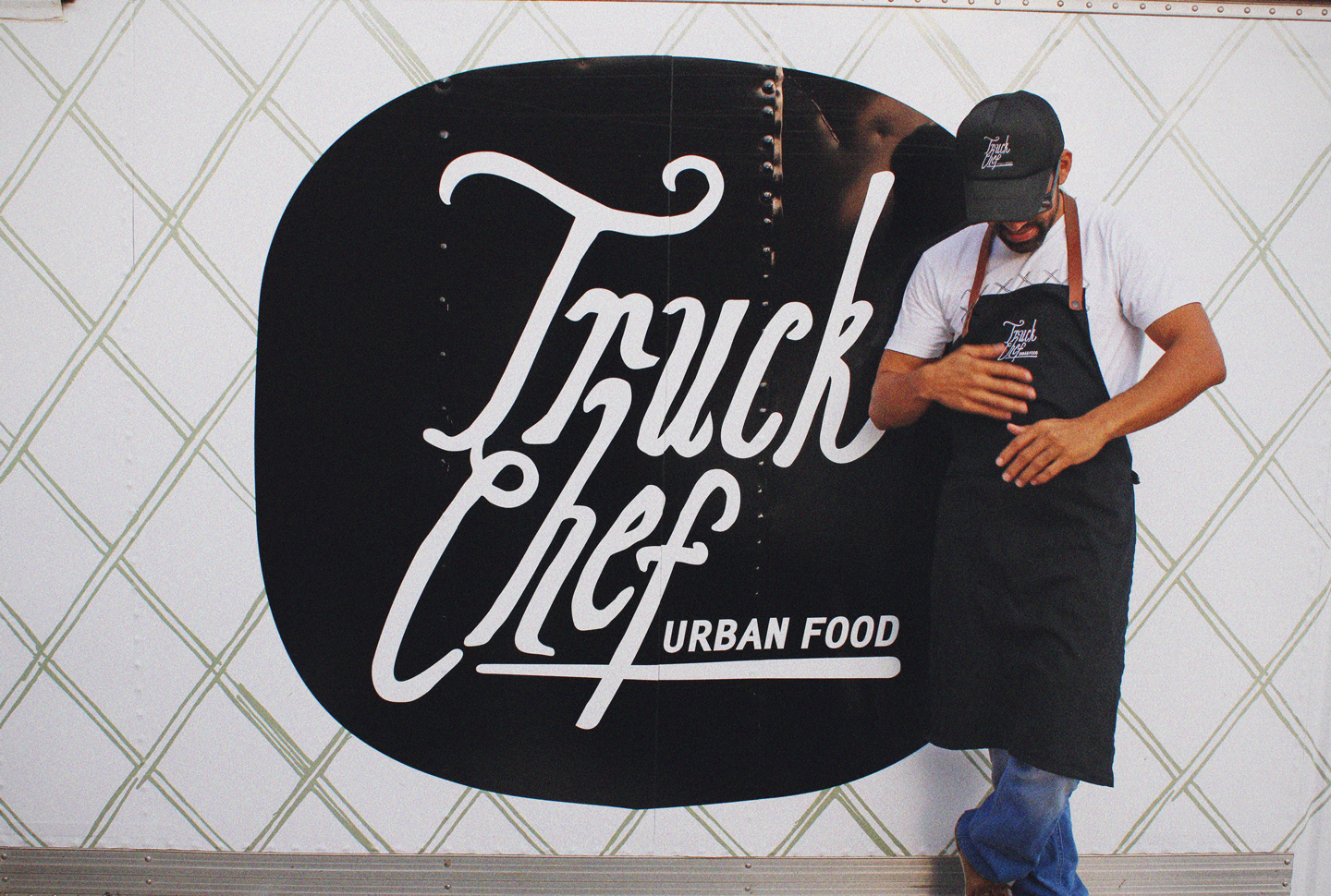
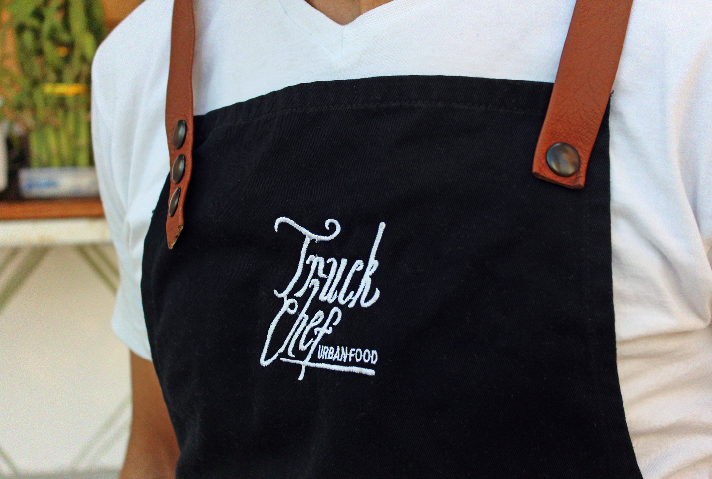
It is a gastronomic microcosm driven by a cosmopolitan approach to innovative, artisanal cuisine. The logo features a hand-drawn typeface that evokes plant motifs and roots, reflecting the type of food served—part of an urban movement with a nomadic service model that prioritizes the quality and care of its ingredients.
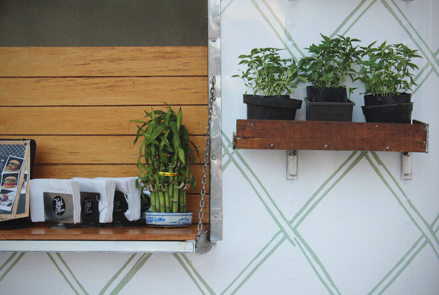
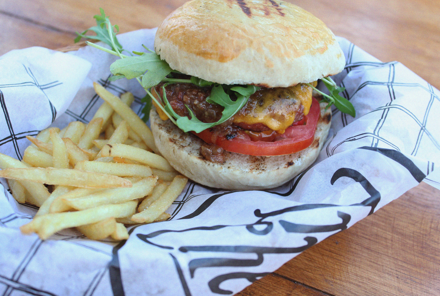
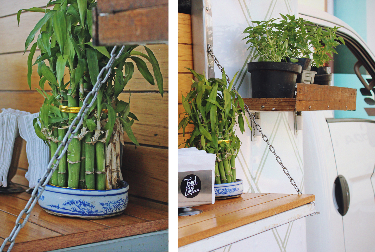
The graphic applications are practical and simple, with colors that contrast with the natural elements and vegetation featured on the truck. The embedded texture is also a nod to organic shapes and roots, creating a harmonious atmosphere that immediately sets it apart from the competition.