Truck Chef

Truck Chef
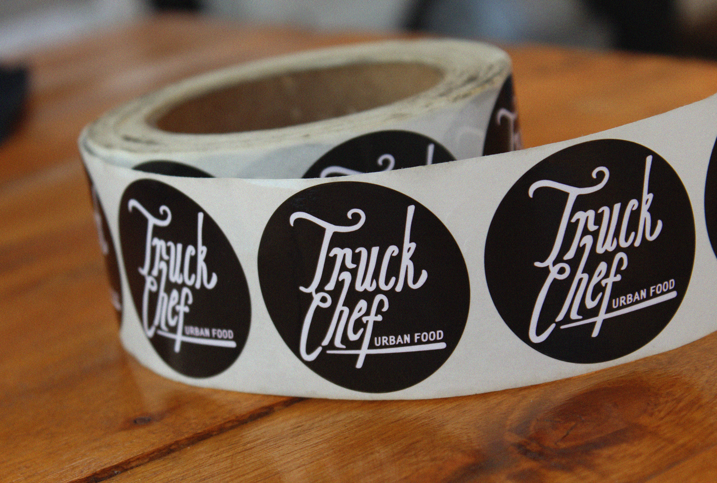
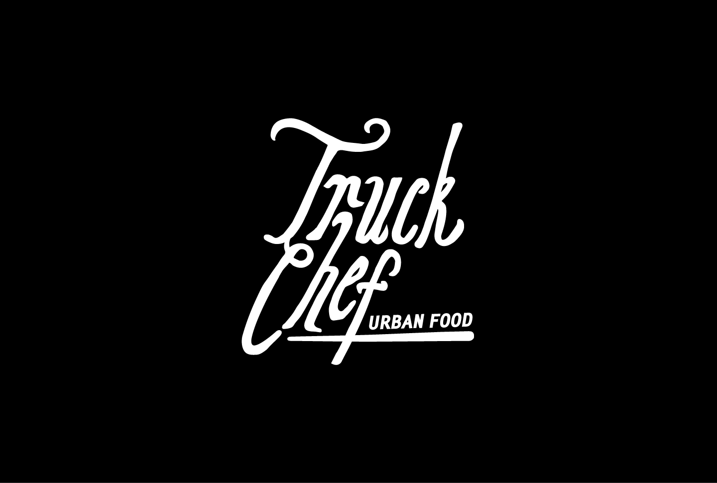
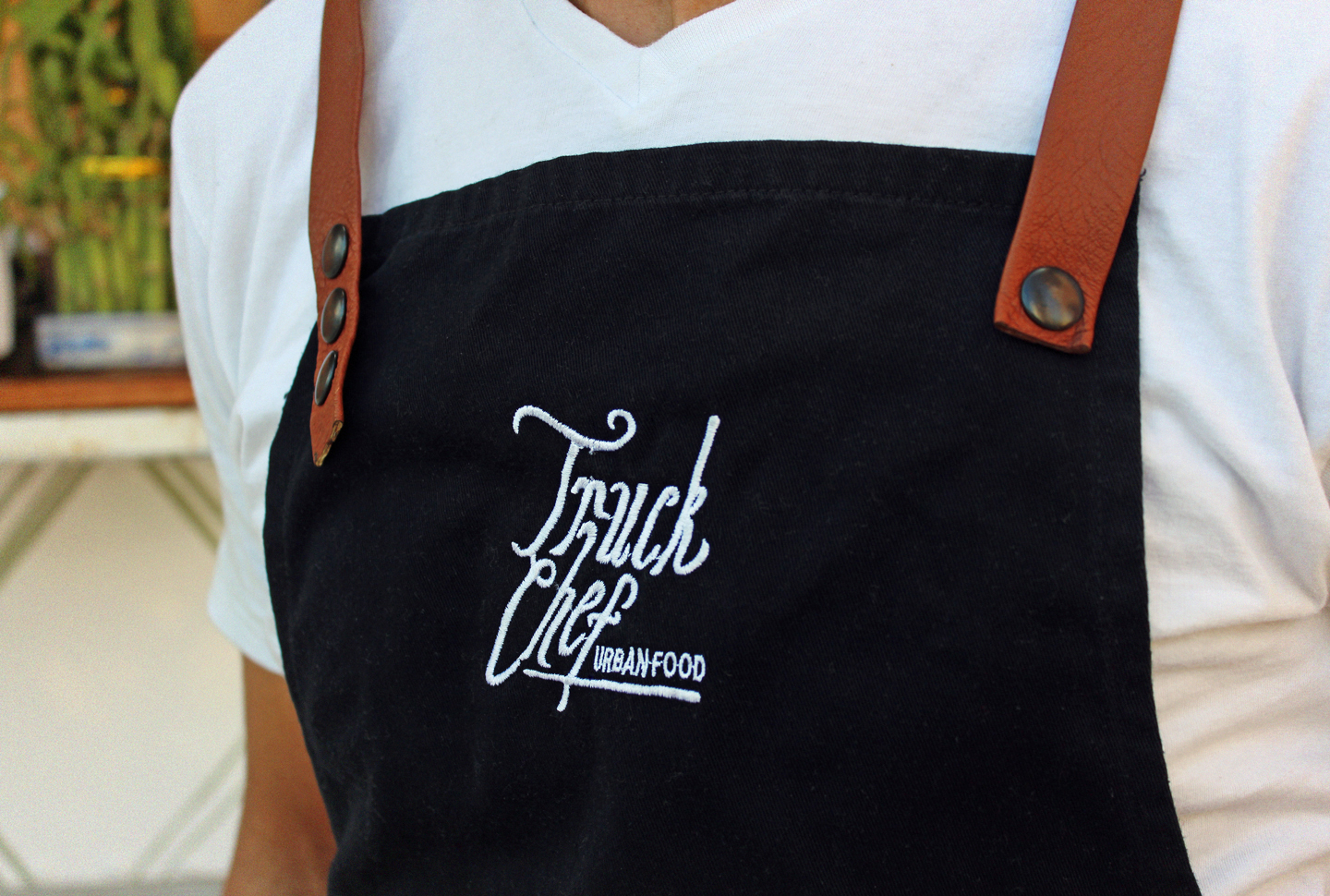
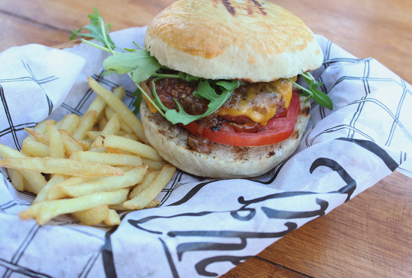
It’s a gastronomic micro universe sustained by a cosmopolite, innovative and artisanal cuisine. The logotype is made with a handmade typography that works as a remembrance of vegetable ornaments and plant roots, in order to be coherent with the type of food that Truck Chef serves, which belongs to an urban movement with a nomad type of service, that prioritizes the quality of each one of the food ingredients.
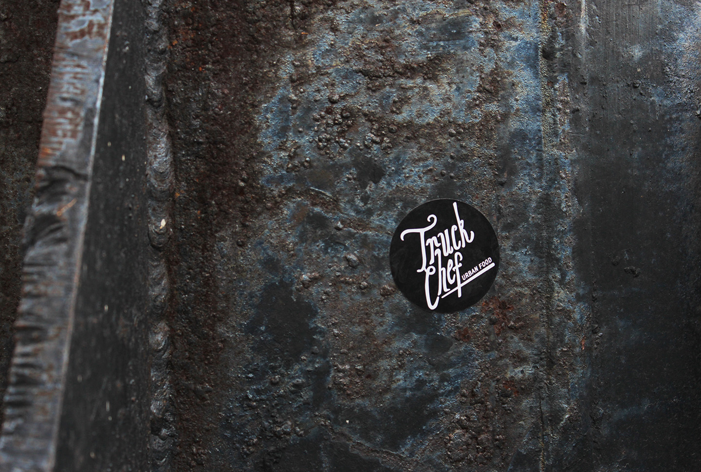
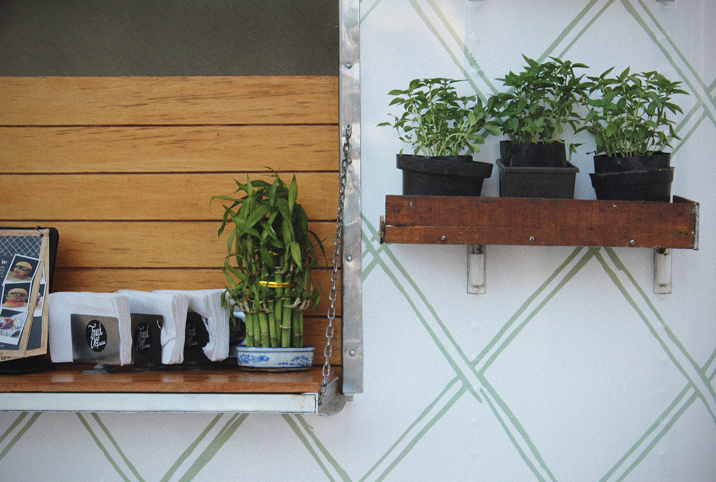
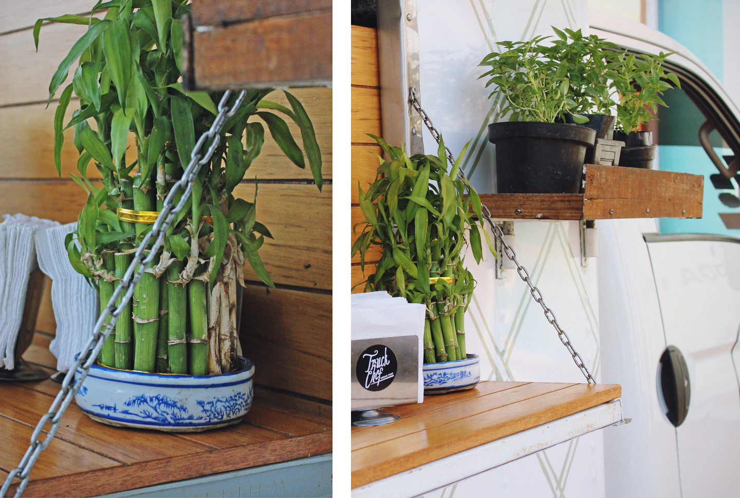
The graphic applications are simple and practical, the black and white contrasts perfectly with all the natural elements and vegetation placed on the truck. The incrusted texture is also a wink to the organic forms and plant roots, which gives an harmonious atmosphere that immediately differentiates from the competition.